Today I am sharing with you the dining room makeover.
There were just a few challenges in this room...all which were easily remedied:o)
In it's former life, this room was a bedroom. As the family grew, they added on, and decided to make this space the dining room. They knocked through the wall and opened the space up to the kitchen.
One of the challenges of this room was the new furniture layout wasn't really flowing for this particular space.
The wall color was also a challenge. The room was very cave-like because it was so dark. That was definitely an easy fix. The homeowners were kind enough to have all the painting done prior to the hubs and I coming in.
This is the "after" shot. It is truly amazing what a new wall color can do for a room, isn't it?
So, here is what we did. We had the homeowners remove the leaf in the table and change the direction, so that the table fit the space better. When they have a large group over, they can always add it back:o)
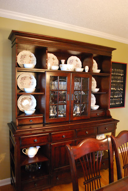
I cleaned out the china hutch, and displayed a pretty butterfly set she had tucked away. I also pulled out her silver tea set. You can see it through the glass panels. Before, the homeowner had multiple plates, bowls, serving dishes, and glasses filling the china hutch to the brim. I lightened the load to make it more visually appealing and less of storage piece.
The homeowners collect spoons on every vacation, and they were displayed in the entertainment room. I thought a better spot for them would be in the dining room, only because you use a spoon more in the dining room than in a t.v. room...great logic, right?:o) I think they work really well in the space.
I found the plate racks at Old Time Pottery for $8 a piece. This was the only thing I hung in the entire house. My fingers were so sore after that, that I decided the hubs had to be in charge of the rest of the hanging:o)
So one last look at the before...
and the after...
Next up for the reveal series will be the Hallway.


