That bubble life cycle graph.....I very much want to believe in it. Does anyone know how the dude who came up with it came up with it? Is there any scientific explanation of why a bubble would behave that way? It seems to make sense, but so far I've held off my wife from wanting to buy in this bubble using numbers, data, and facts. It's getting tougher the longer this drags on, and I'd love to show her that bubble lifecycle chart and say "Look! We're right at the precipice! Don't give up now, Dr. So-and-so proved that humans are sheeple and act in this way because of X Y and Z!"
The graph is well-known to demonstrate bubble psychology. The version I use (http://tinyurl.com/ntvgvj) which is widely duplicated on the net, was drawn up by the Professor of Economics and Geography at Hofstra University, Jean-Paul Rodriguez. I cant find his original article on the net anymore, but it was dated 2006.
The reason it works so well, is that there are so many who didn't get in on the bubble run-up and jump in when the price first breaks. They are the last buyers and the next drop has no more buyers to prop it up and we drop longer and deeper. The steepness of the drop can be sudden or slow and steady.
It seems to describe psychological behaviour of bubbles very well.
It has played out almost perfectly in the US. I have included a chart and some links to go over:
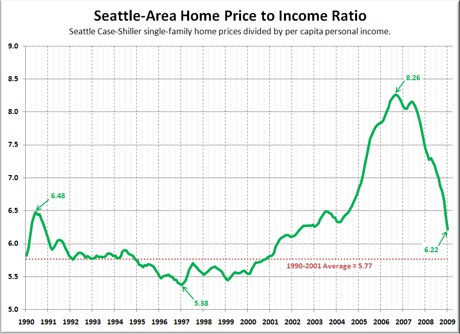 Source: Seattlebubble.com
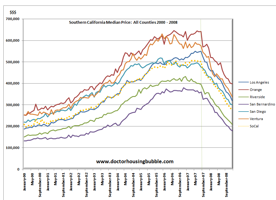
The notches at the top can be slightly different in different bubbles. Here is the chart for California:
http://www.doctorhousingbubble.com/wp-content/uploads/2008/04/ca-median-price.jpg
But when it finally drops- it drops:
http://www.doctorhousingbubble.com/wp-content/uploads/2009/01/socal-housing-prices.png
It is not just RE - all bubble assets TEND to follow the graph. look at gold in the late 1970's. It peaked, dipped ran right back up and then crashed good and hard.
http://www.usagold.com/reference/prices/gold-price-history.gif
A quick look at the NASDAQ chart from 1997-2002 will show a similar pattern.
The shape of the graph gets skewed by desperate efforts of governments to keep the asset at bubble levels, and stop it falling. They do this even at the expense of future generations of savers and tax-payers, and just exacerbate the situation.
It would be better to allow a collapse and then pick up the pieces, rather than the slow bleed that eventually ends at the same place. The Trillions that the US has spent on trying to prop up housing has just slowed the process but the end-point is the same. Income and housing have to come back into balance.
Will we follow the graph?? Who knows, just because the US did doesn't mean we will too. Maybe we are not in a bubble!
Maybe the resilience of our prices is an indication that we were very undervalued in the past (which as I stated before we probably were) and are now reaching fair market value on a global/resource availability scale. Heck, maybe we are the new Monaco of the North?
I personally think that we have over-shot to way over-valued, but that it is just my opinion, which was vindicated for 6 months late last year and early 2009 but which reversed after that. I am waiting to see where we go from here.